
A note from the color desk,
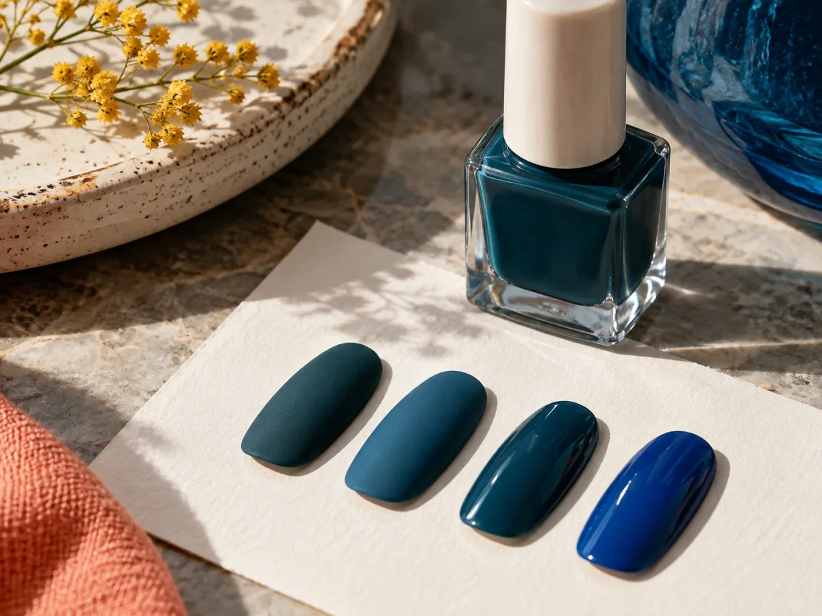
The color on the label is only part of the picture. Finish determines how much of the nail shows through, how light moves across the surface, and whether a shade reads quiet or emphatic. Comparing finishes first can keep a small collection from becoming a drawer of near-duplicates.
The photographs illustrate the ideas; they are not records of product testing.
Describe the surface
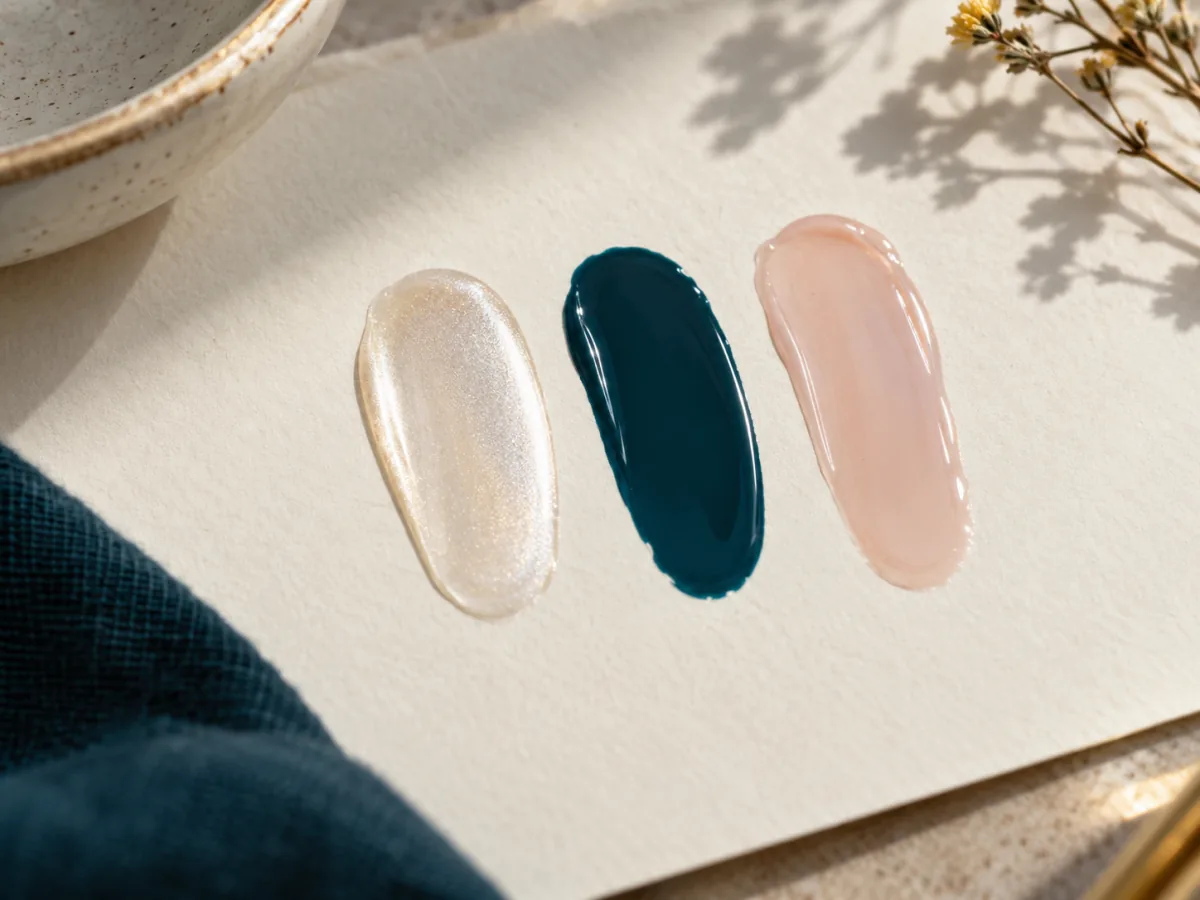
A cream color reads as a comparatively even field; a sheer one leaves more of the underlying nail visible; a shimmer catches small changes in light. These are descriptions, not promises about performance. Look at the actual bottle and maker's description, because brands use finish names differently.
Compare like with like
If two bottles look nearly identical, set a sample of each on the same neutral background. One might appear warmer only because it is more transparent. Another might look darker because its finish reflects less light. This is especially useful with pale shades that appear interchangeable on a crowded shelf.
Give application space
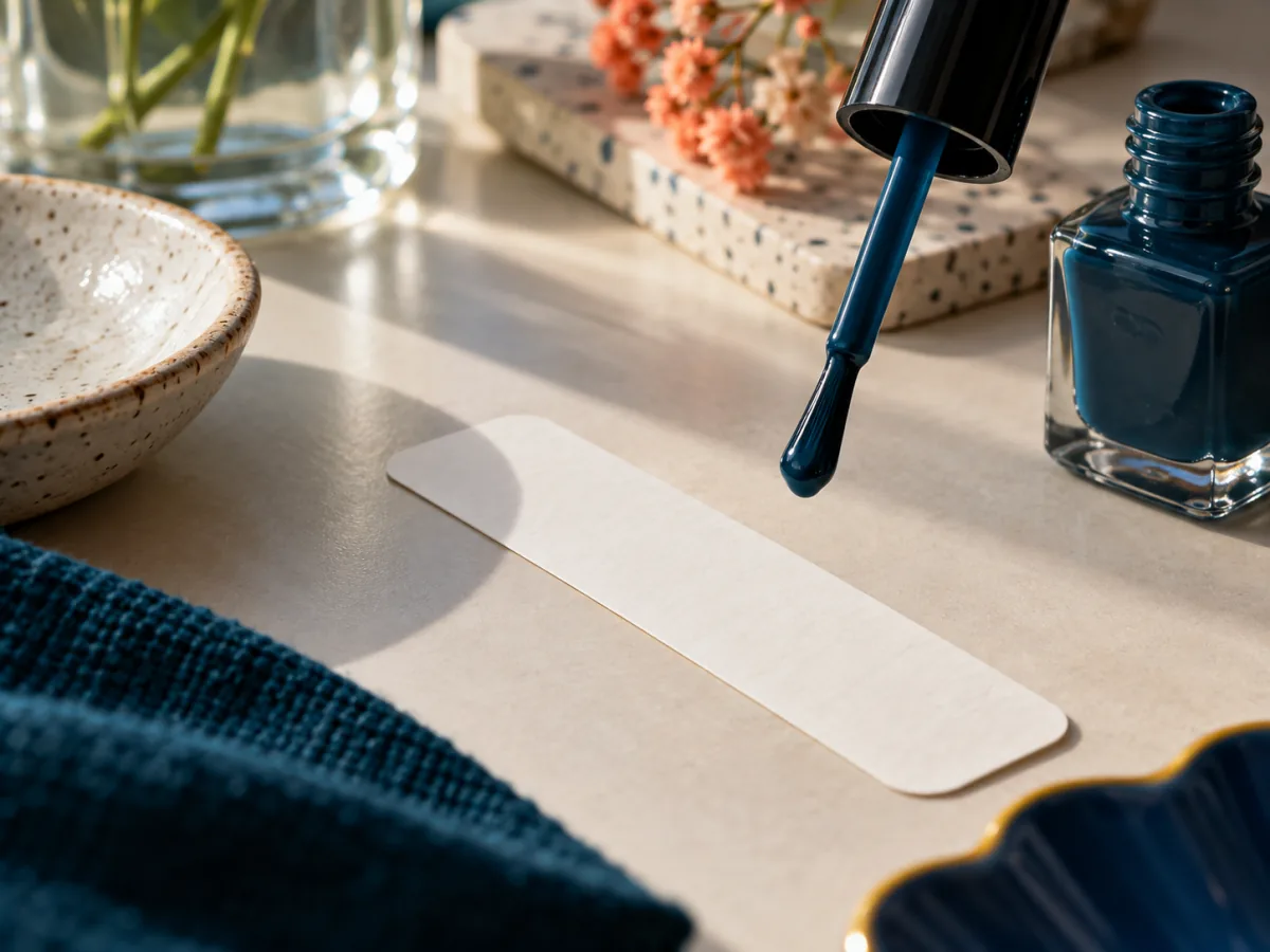
Finish can affect how visible a brush mark appears, so plan enough uninterrupted time to apply according to the maker's directions. Work on a protected surface with ventilation appropriate to the product instructions. There is no universal number of coats or drying time that can be promised across formulas.
Choose the job
Ask whether you want a clear field of color, a translucent note, or a glint when your hands move. That answer is usually more helpful than asking which finish is generally best. Keep the choice tied to your own routine and to the bottles you already have.
The finish is part of the color story, not an afterthought. — Paige