
Dear color-curious reader,
A wall of bottles makes every shade seem possible. A pair of colors, held beside the clothes or objects already in a day, gives the eye something useful to answer. The question is not which color wins forever. It is which one makes sense now.
The photographs illustrate the ideas; they are not records of product testing.
Start with two
Put two air-dry polish colors on separate pieces of plain paper. Avoid reading the names first: names can describe a mood that the color does not quite deliver. Set the samples near the fabrics you actually reach for, then step back. A vivid blue might stand neatly apart from a patterned sleeve; a soft coral might become part of it. Either effect can be the right one.
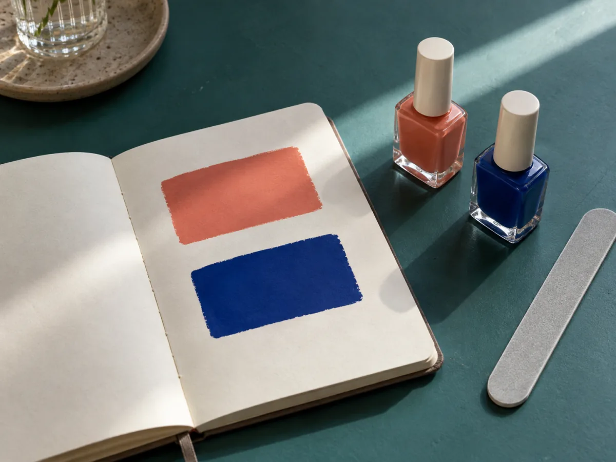
Change the light
A color can feel different beneath a shop light, near a window, and under a lamp. Look at both samples in more than one ordinary setting before committing. You need not build a perfect lighting test. You are simply checking whether the shade still feels like your choice when the surroundings stop flattering it.
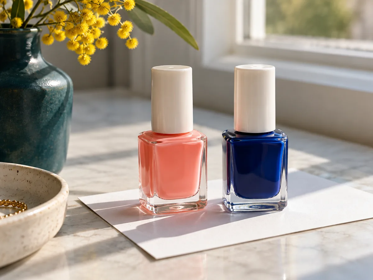
Color, then consequence
Before buying another bottle, ask what it would join. Does the shade fill a real gap, or is it another version of one you already own? Consider where it would live, what you would remove to make room, and whether a small set of colors would serve you better. A careful pause can be more useful than a third swatch.
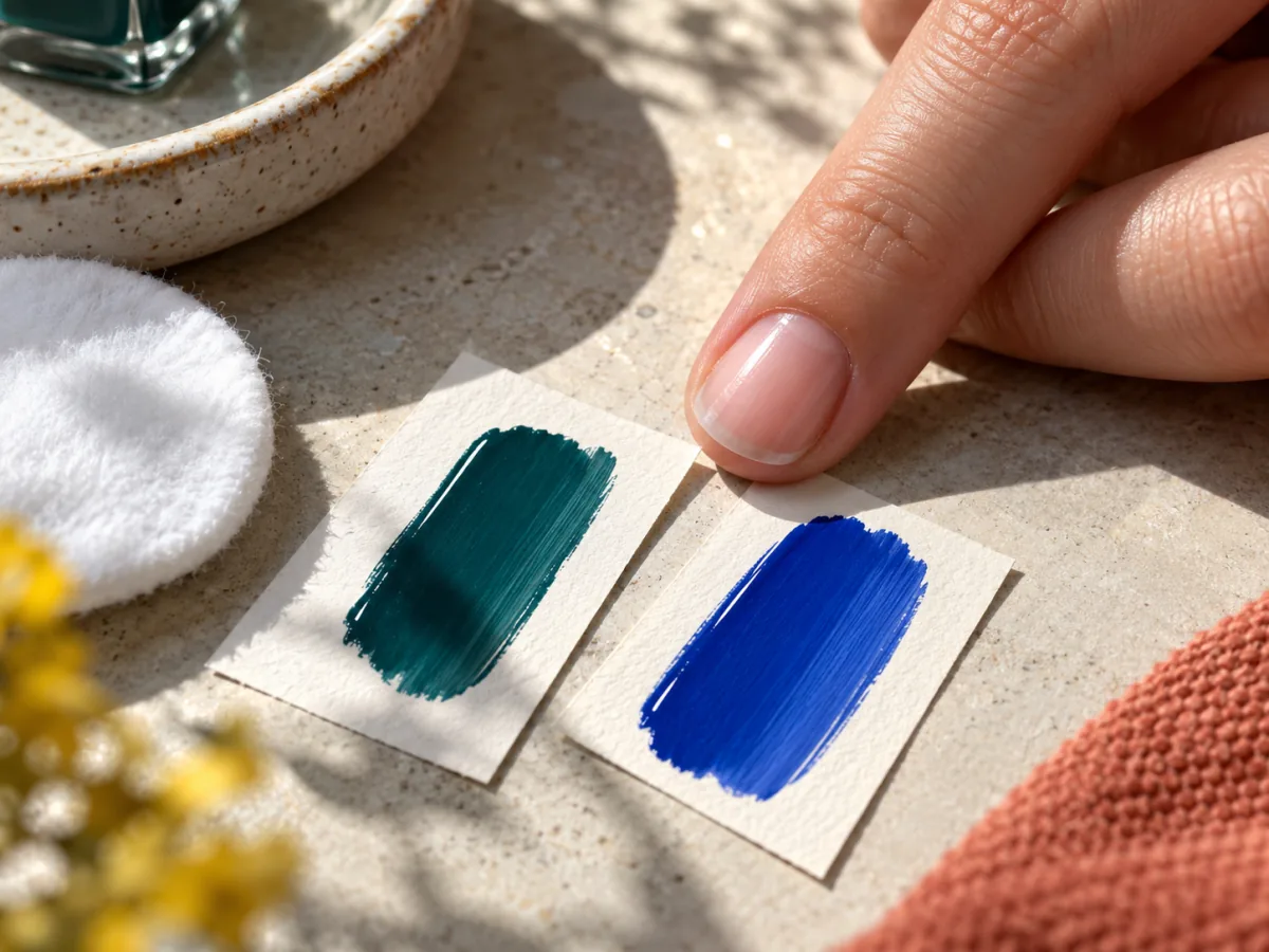
Leave room to change your mind
A color decision is reversible. Keep the comparison modest, follow the polish maker's application instructions, and let the day supply the final context. If neither candidate feels useful after a second look, that is an answer too.
Keep the shade that gives your eye somewhere to land. — Paige