
Dear undecided eye,
Two bottles can both promise warmth while doing different things beside the same shirt. One red may sharpen an outfit; a softened rose may echo it. Neither is inherently more wearable. The useful comparison is made in the light and clothing of an actual day.
The photographs illustrate the ideas; they are not records of product testing.
Name the difference you can see
Instead of asking which bottle is the more flattering one, describe the visible shift. Is one brighter? Browner? Cooler? More transparent? A simple observation gives you a repeatable way to compare colors without relying on a poetic label that may be different on every bottle.
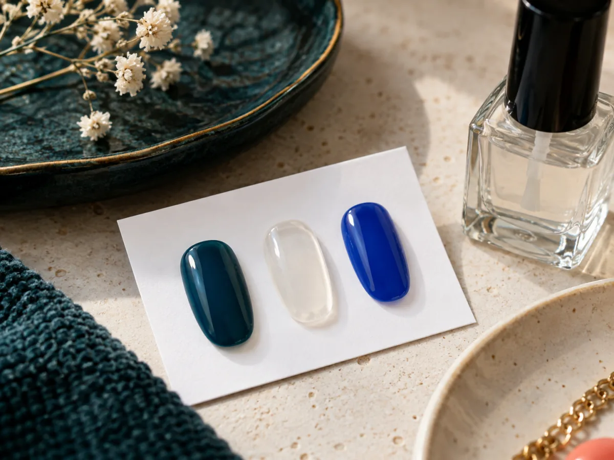
Look near familiar things
Set the two samples beside a sleeve, bag, or fabric you already own. Daylight helps reveal the comparison; a second look indoors catches what the first missed. Use a blank card rather than a painted nail when you are only exploring the palette, and do not treat an illustrative photograph as a product swatch.
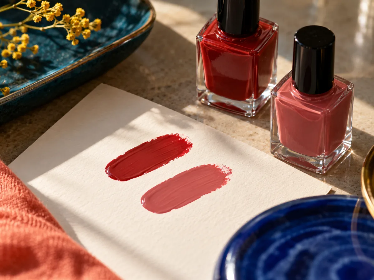
Think about the bag
If this is for a trip or a busy week, consider whether carrying a bottle is necessary at all. If it is, keep the original labeled bottle closed and packed according to travel rules and product directions. A small kit should solve a specific need, not become an excuse to buy every similar shade.
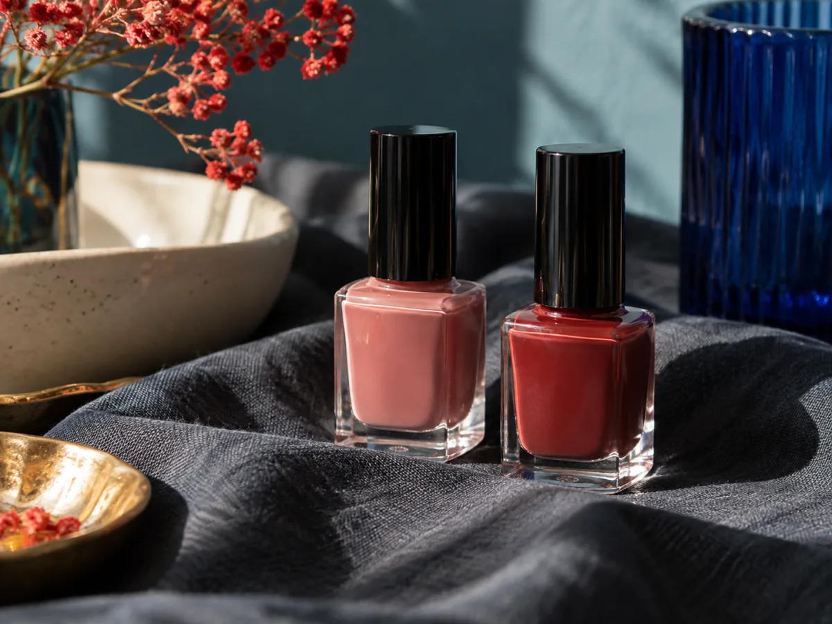
Keep the reason
The better choice is the one whose effect you can explain to yourself. If you want a vivid contrast, choose the color that supplies it. If you want a quieter echo, choose that. If both feel interchangeable, keep the bottle you already own.
Color names are suggestions; the light has the last word. — Paige